Cycle Aura
Designed Cycle Aura, a digital experience focused on the female cycle, to provide women with daily guidance. I developed the idea, created the visual identity, designed the user flow, and built the fully interactive product using no-code tools
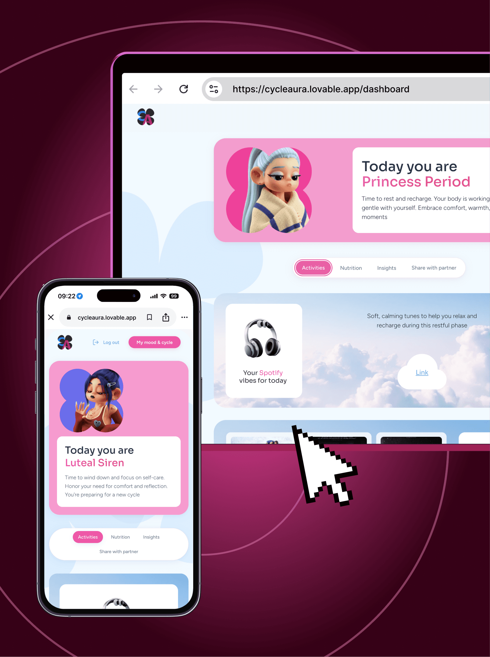
 Go to website
Overview
Most period-tracking apps tell you when your period is coming. But your cycle is more than a date on a calendar — your energy, mood, and body change throughout the month.
I wanted to build something that helps women understand those changes and actually use them in everyday life. Cycle Aura turns cycle tracking into something more personal, practical, and maybe even enjoyable
The Problem
Most cycle trackers tell you where you are in your cycle, but not what you might actually want to do with that information.
Sometimes you’re craving a specific kind of music, a comfort movie, a night out, or just a very particular activity — and those preferences can change with your mood and energy throughout the cycle.
I wanted to create something that goes beyond tracking and gives women ideas that actually match how they might feel in each phase
My Role
• Product concept & strategy
• UX and user flows
• Visual direction
• UI design
• Content & microcopy
• No-code implementation
Research & insights
I researched the topic through my own experience and conversations with friends, exploring how mood, energy, and preferences change throughout the cycle.
A clear pattern emerged: what feels good one week can feel completely wrong the next. Sometimes you want to be social, sometimes you want comfort, quiet, or a very specific movie and playlist.
These insights shaped the product structure, dashboard sections, and core features
Defining the Core Experience
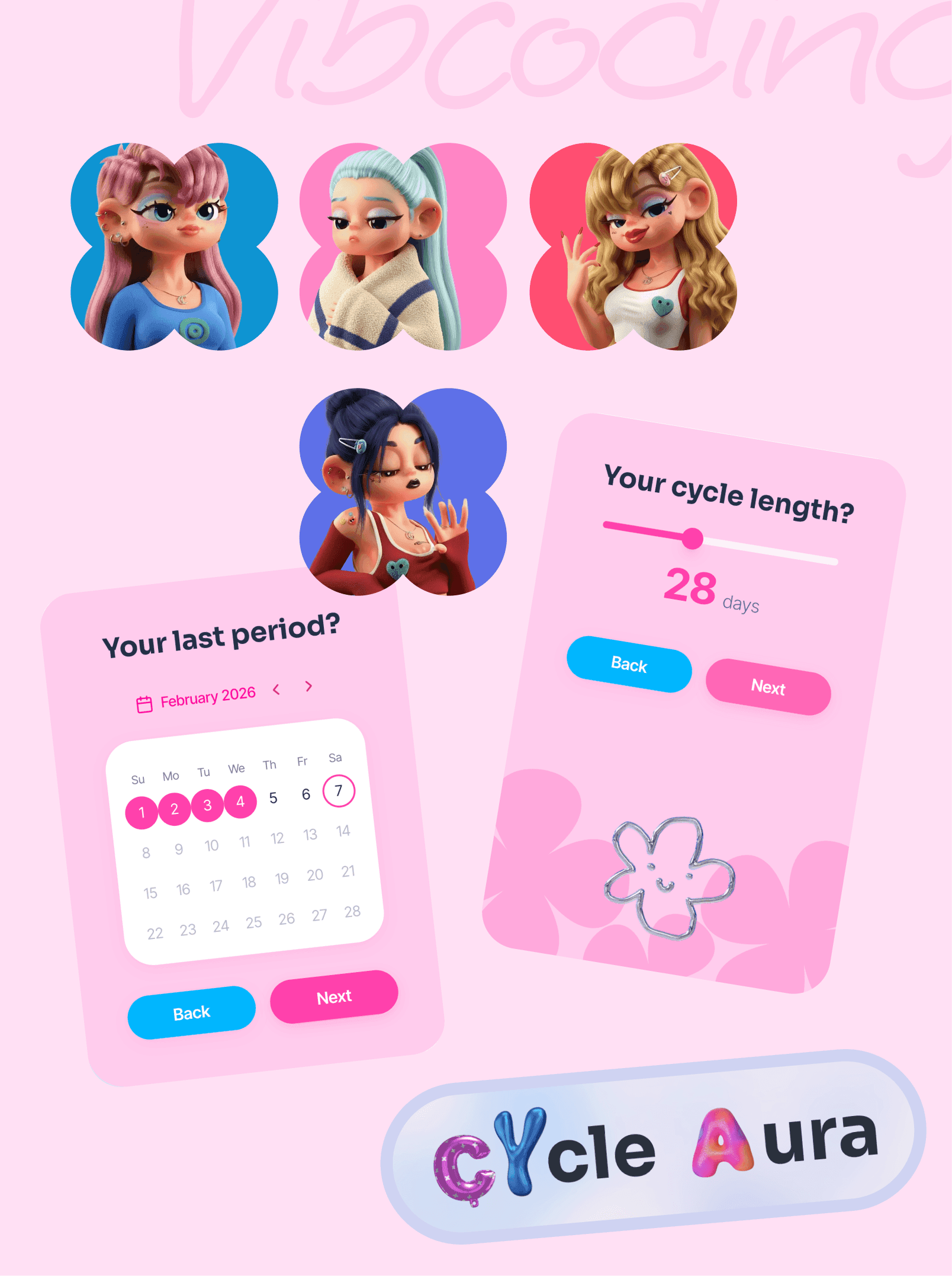
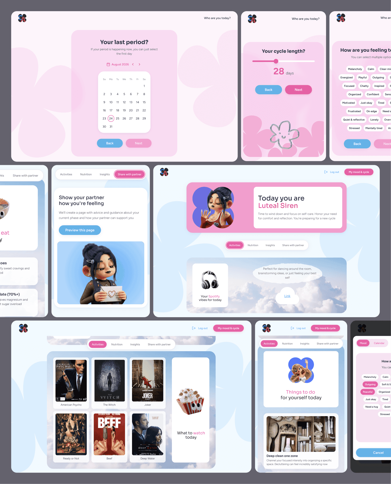
I wanted the product to feel useful from the very first interaction, so I designed an onboarding flow that determines the user's current cycle phase based on their last period, cycle length, and current mood.
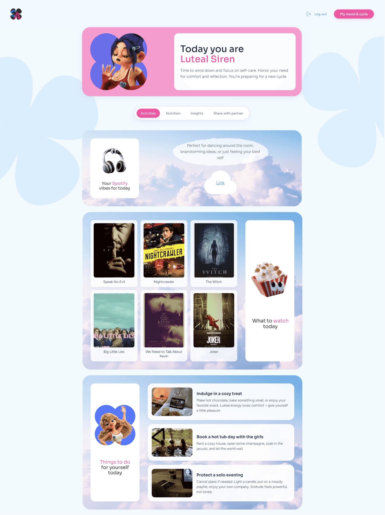
Once the phase is calculated, the dashboard becomes the main hub of the experience. It starts with an animated card featuring the user's current phase character, followed by four sections:
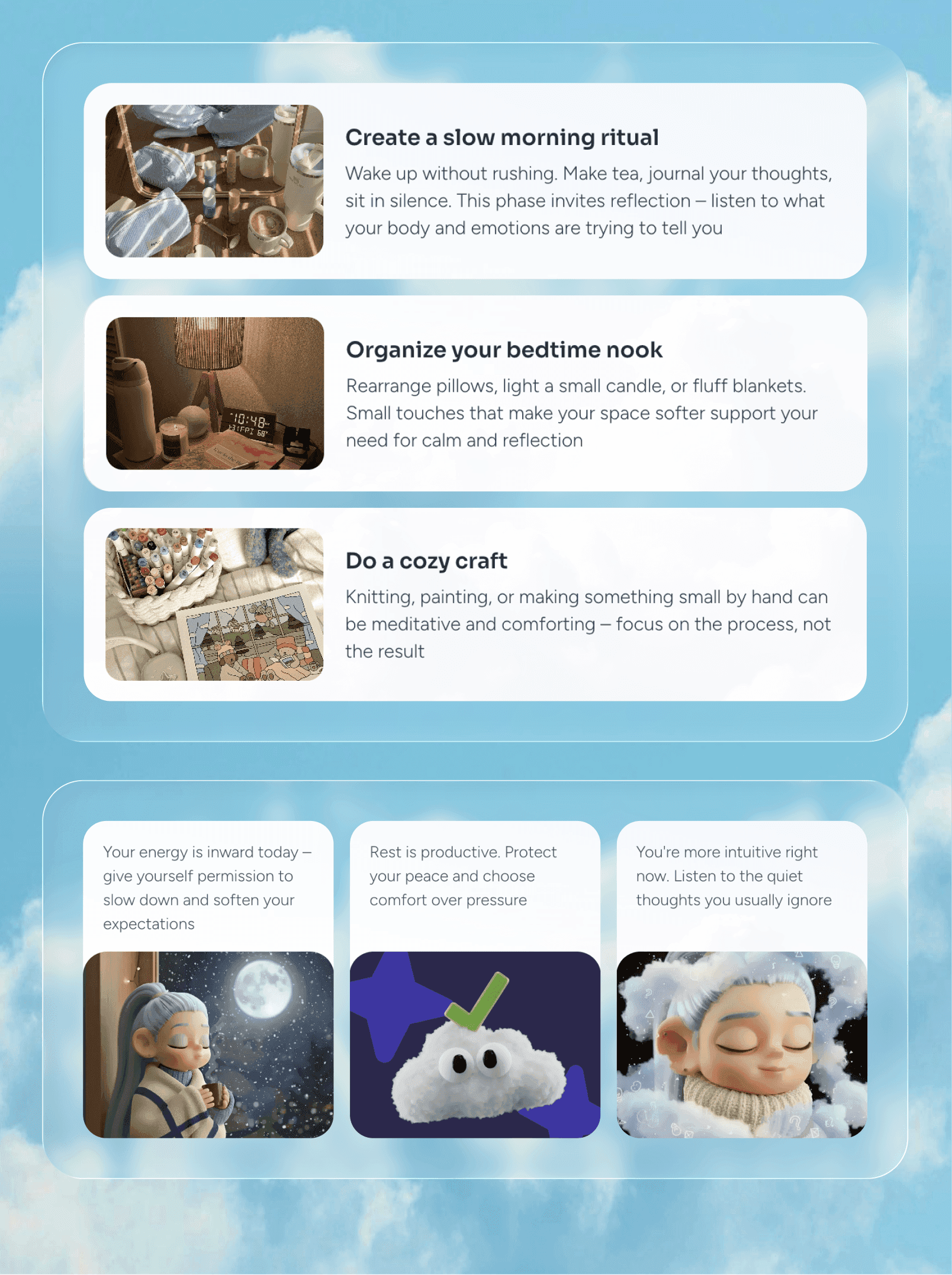
Activities — curated Spotify playlists, movies and shows, and activities that fit the mood and energy of the current phase.
Nutrition — simple food and nutrition recommendations.
Insights — supportive cards explaining possible emotional and physical changes and helping users make sense of how they might be feeling.
Share with Your Partner — a simple guide explaining the current phase, possible mood changes, and how a partner can be supportive. It came from conversations with women who said their partners often struggle to understand these changes — so I turned it into a little cheat sheet.
Content
Once I understood what kind of experience I wanted to create, I started building the content around each phase.
I curated recommendations for things to do, watch, listen to, and explore, making sure they matched the mood and energy associated with each phase.
Tone of voice was especially important here. Some phases can already feel emotionally heavy, so I wanted the content to feel warm, playful, and supportive — more like advice from a friend than instructions from a health app
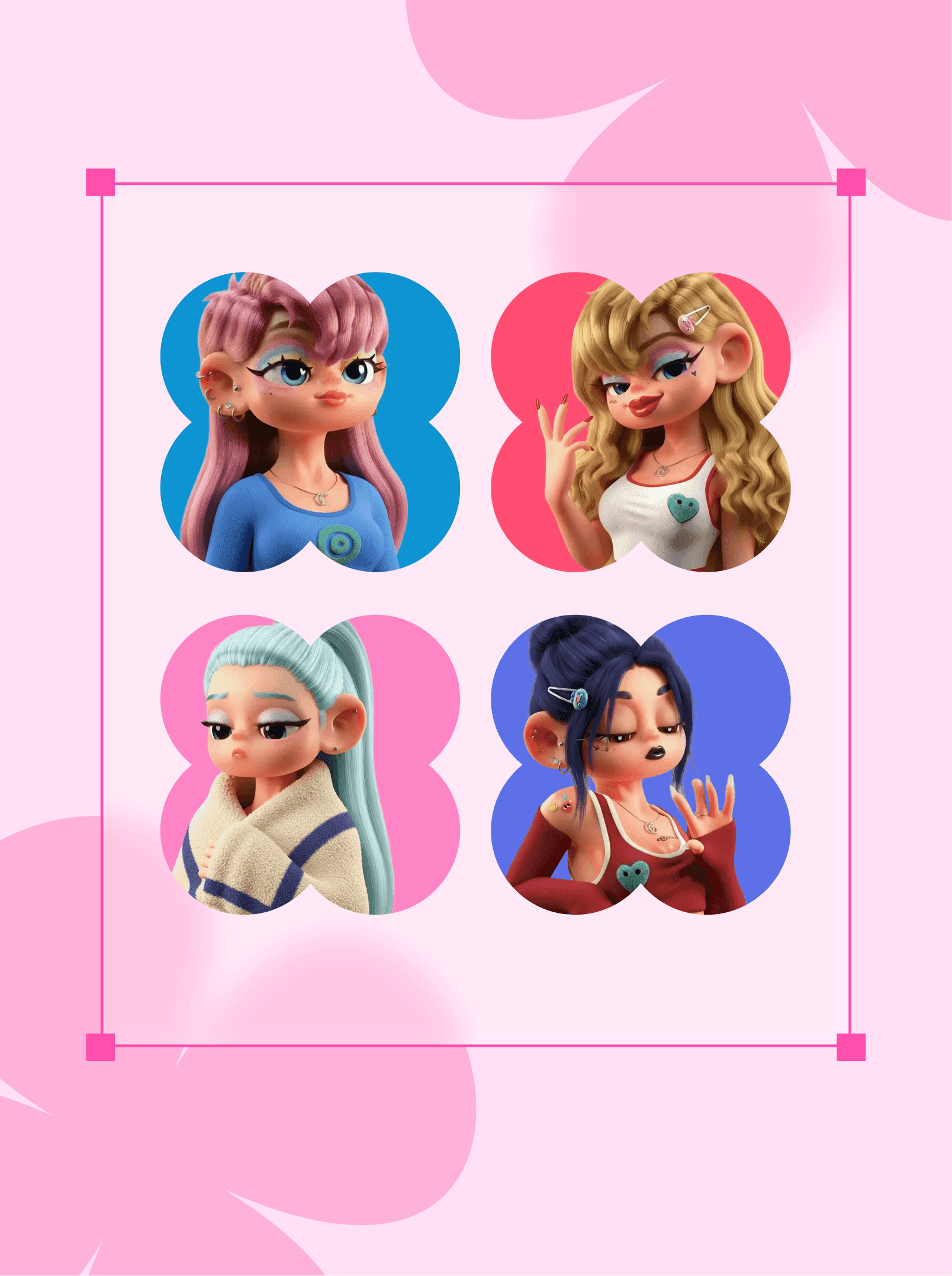
characters
I didn't want the four phases to feel like four sections of a biology textbook, so I gave each of them a personality:
Follicular Muse
Ovulation Queen
Luteal Siren
Princess Period
Creating the characters was one of the most fun — and surprisingly tricky — parts of the project.
For example, Luteal Siren plays with that very relatable "okay, everyone please leave me alone" energy that can sometimes come with the luteal phase. But I didn't want to tell users how they were supposed to feel.
That's why the onboarding includes a small disclaimer: the phases describe common patterns, not rules. You might feel completely different — and that's perfectly fine.
The characters became a visual thread throughout the product, appearing in phase cards, recommendations, and even on the Spotify playlist covers
From Figma to Lovable
Once I had the architecture, wireframes, content, and visual direction in place, I designed the full product in Figma — from the onboarding and dashboard to the phase pages, recommendations, playlists, and all the little interactions in between.
At this point, the whole experience existed as a complete design concept.
Then came the fun experiment: could I actually build it myself?
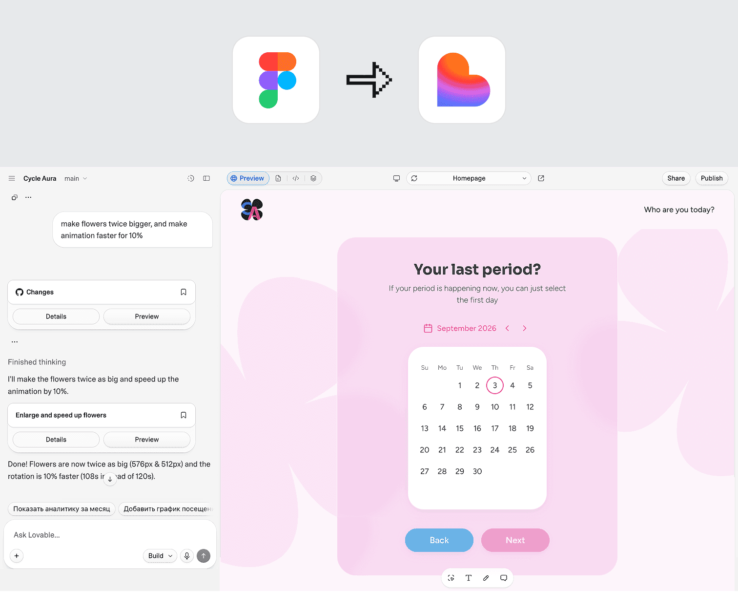
I decided to take my Figma designs into Lovable, a no-code platform, and turn the concept into a working interactive website with the help of AI.
It was my first time taking a project beyond the design stage and actually building it myself — basically, I temporarily promoted myself from designer to developer :)
6. Iterating & Refining
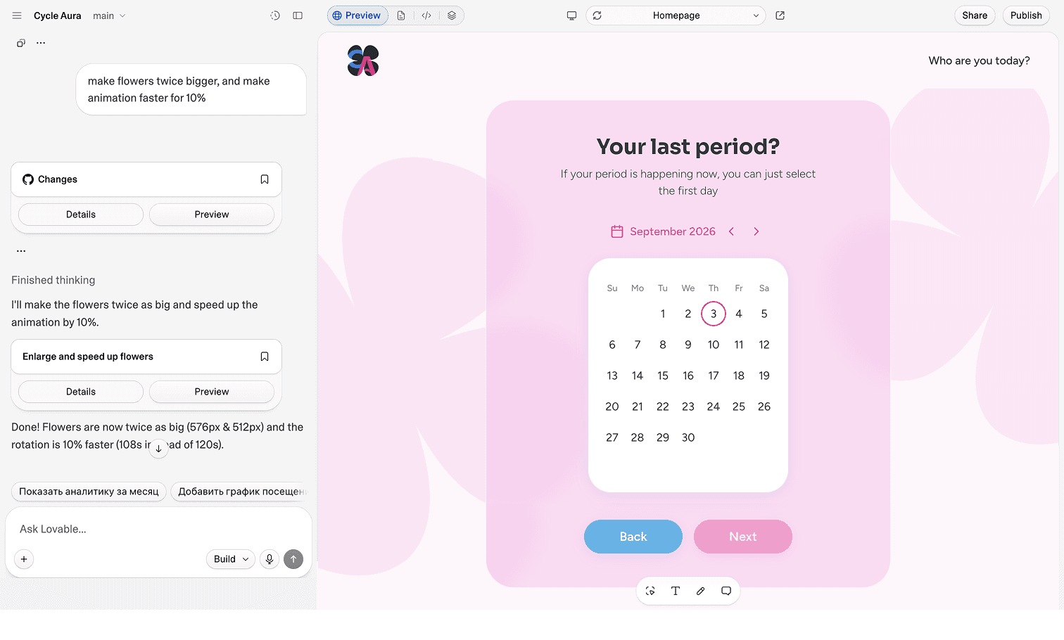
Once the first version was up and running, I could immediately see what worked and what needed tweaking. I kept refining layouts, interactions, copy, animations, character placement, and small details until the experience felt close to the original vision.
The whole project took around two weeks — which made it a surprisingly good experiment in how far you can take a product when you don't have to wait for a handoff to engineering